Dr. Isabella Ristov
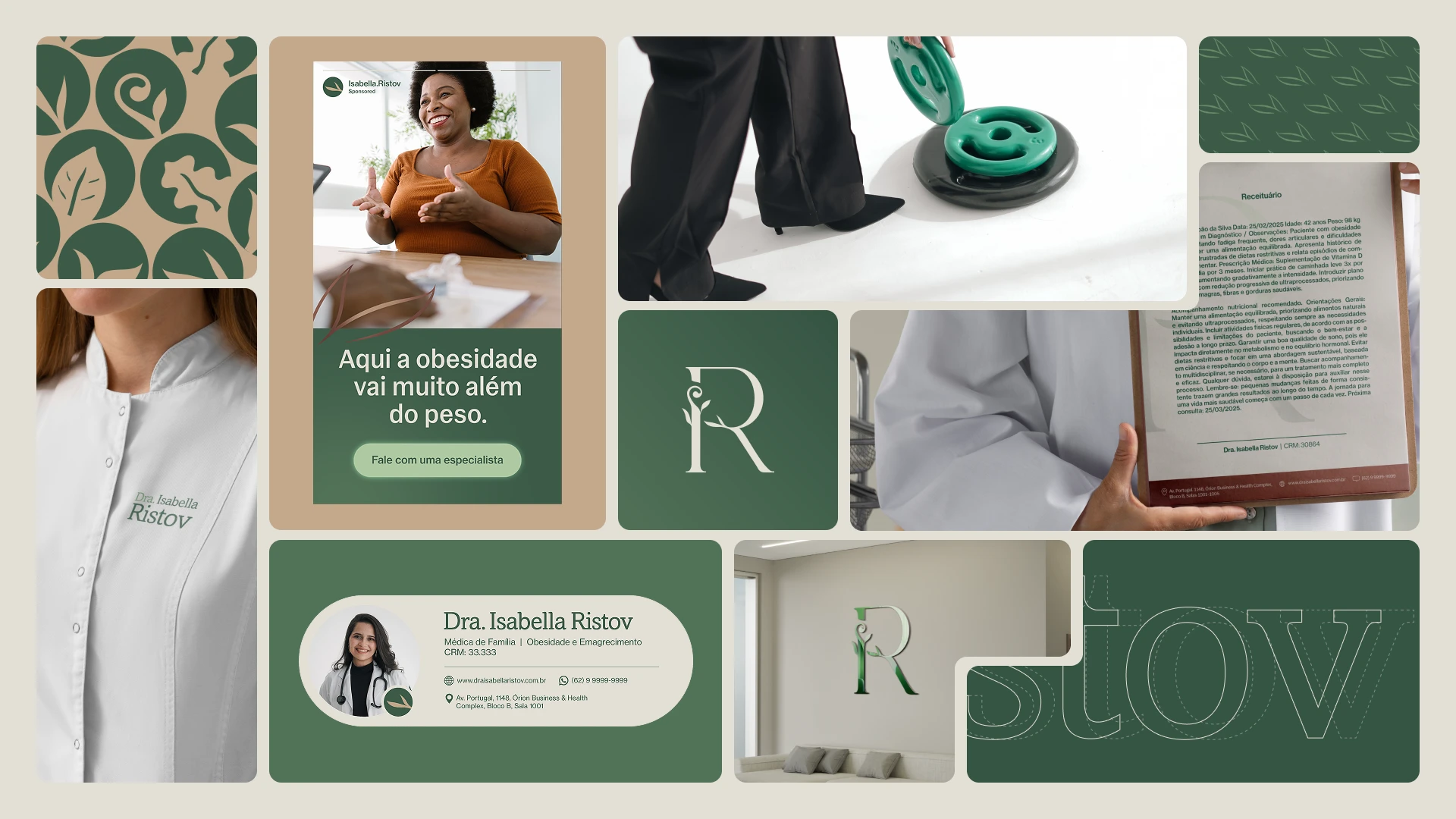
Dr. Isabella Ristov is a physician from Trindade, Brazil, specializing in Family Medicine and Obesity, with a clear mission: to transform lives through scientifically proven methods paired with genuinely human care.
From the very first conversation, her charisma and drive to do things differently were undeniable. Shaped by years working in Brazil’s public health system, Isabella knew she could offer more — the focused attention and dedication that every patient deserves.
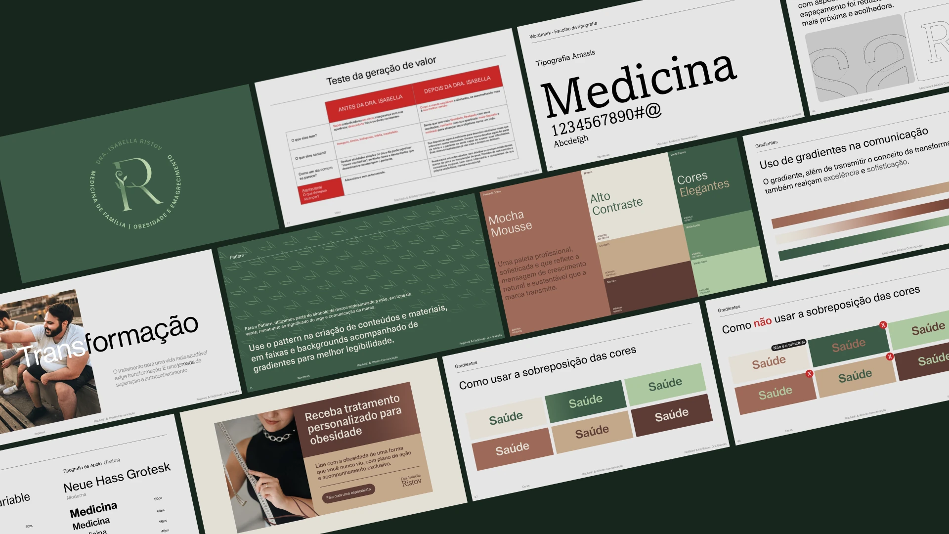
Our challenge was to translate her essence into a precise brand position: scientific authority with genuine warmth. We worked across brand strategy, positioning, visual identity, and communication platform — from concept to execution.
Dr. Isabella Ristov | 2025 | Strategy: Vinícius Machado | Positioning: Vinícius Machado | Design: Vinícius Machado | MACHADO STUDIO ALL RIGHTS RESERVED.
Dr. Isabella believes that organic progress, amplified by the latest scientific advances, makes the patient’s journey not just safe — but truly transformative. Through scientific rigor and motivational communication, she drives real change in habits and in lives.
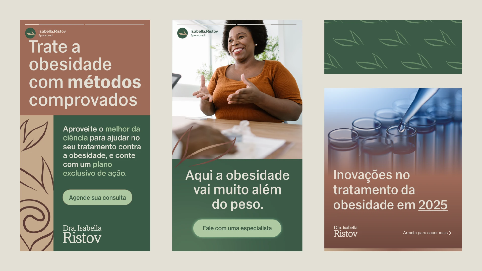
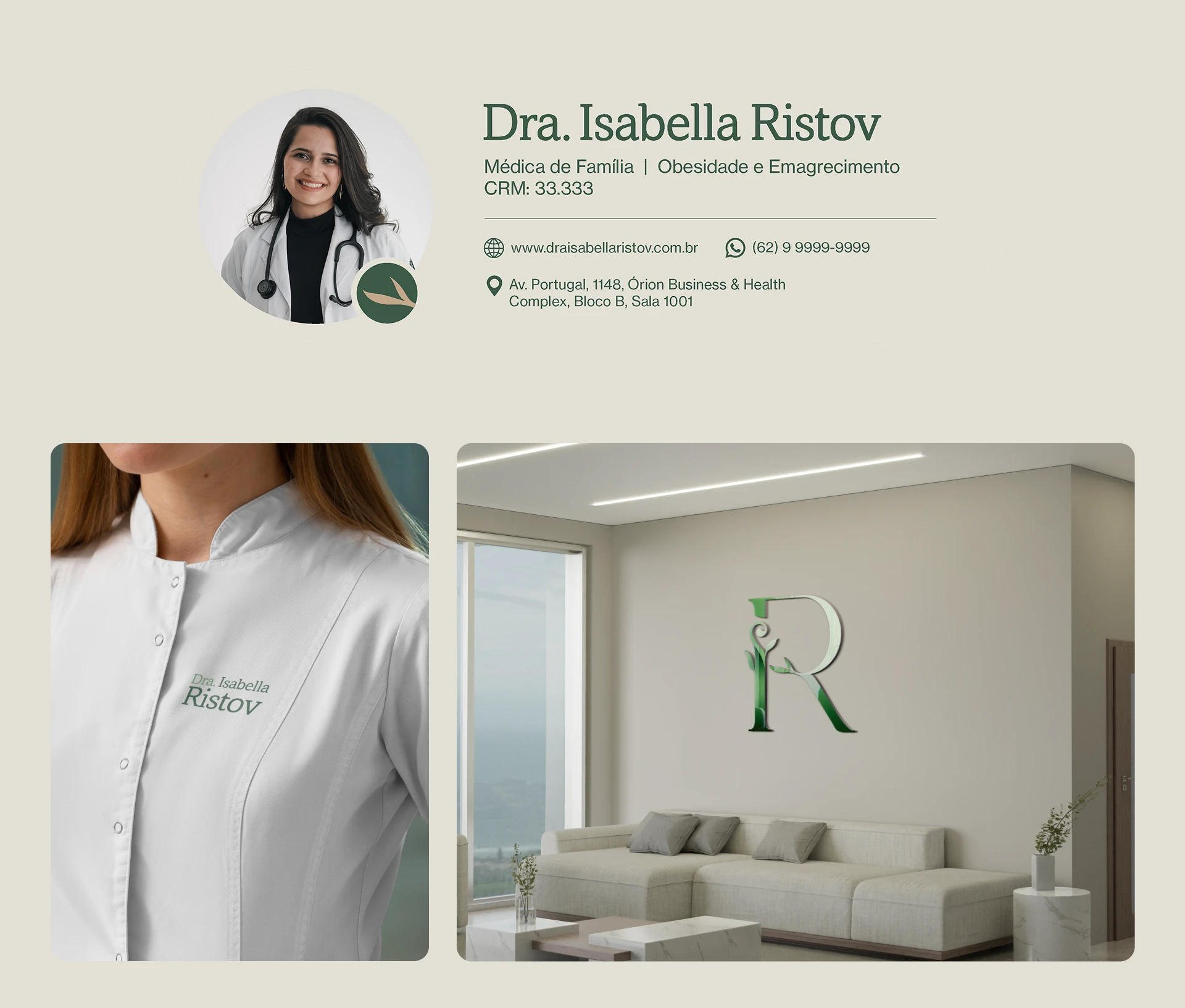
In this project, we translated that vision into a visual identity that is clear, professional, and welcoming. From strategic positioning to the full development of the brand’s identity and communication platform — every decision was guided by Dr. Isabella’s essence.
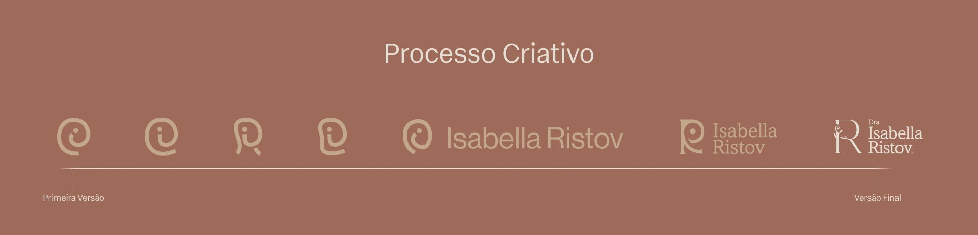
The symbol went through many iterations before we arrived at what truly mattered. The process of deep alignment with Dr. Isabella’s vision made it possible — without the sustained dialogue with the client, we would never have reached the right solution.
One of her key specializations is Motivational Interviewing, which gave us a central insight: care may be universal, but each patient’s journey is entirely their own.
Journey → Transformation → Growth
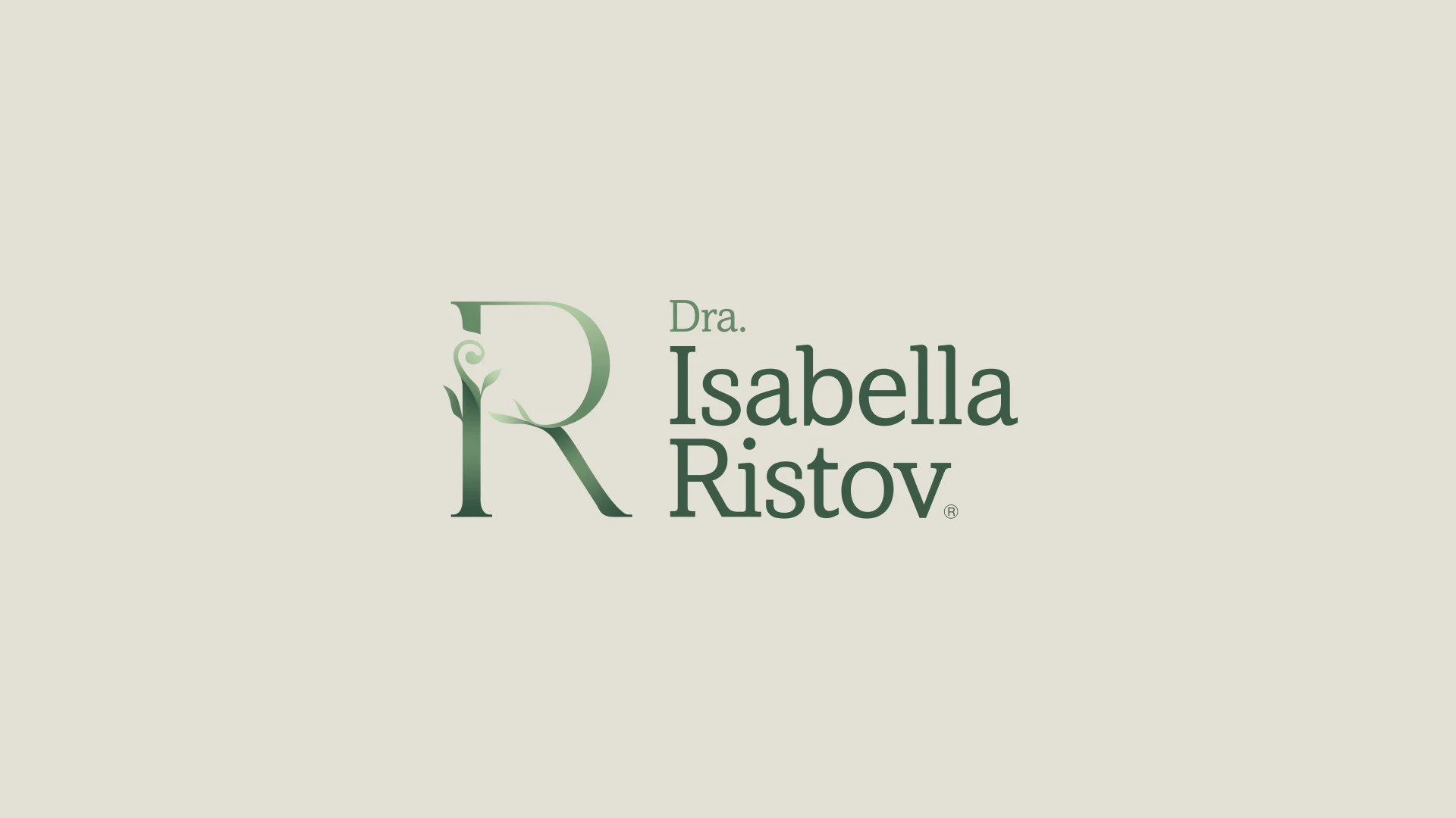
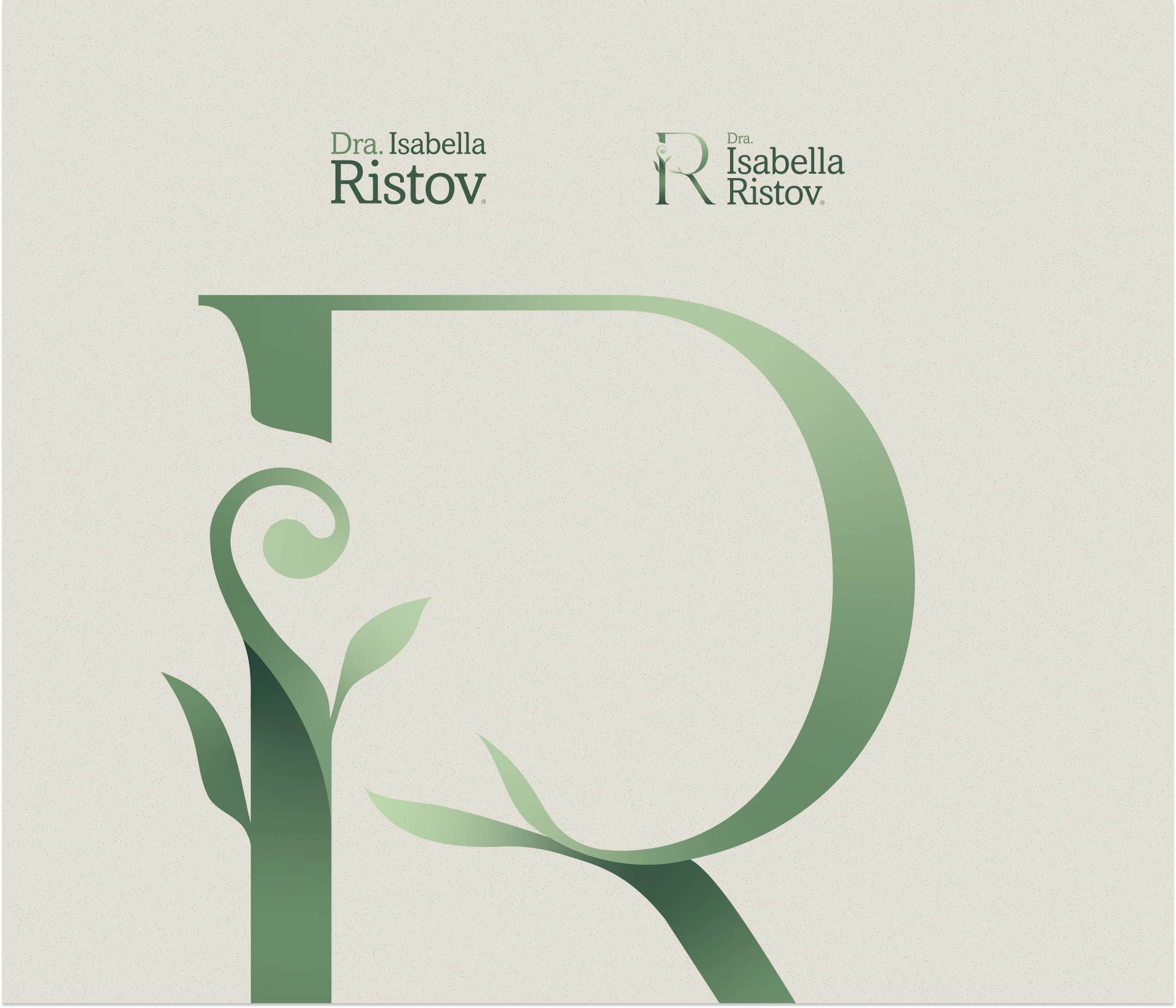
The resulting symbol weaves Dr. Isabella’s initials (I and R) with elements evoking the growth of a plant — a visual metaphor for the continuous, transformative journey of her patients. Elegant, refined, and deeply meaningful.
With the symbol defined, the next step was building a logotype that balanced authority with approachability. The choice was Amasis — a typeface with traditional references that anchors the physician within her field, while still conveying warmth.
We refined the letter-spacing, softened the corners, and adjusted the serifs — making the typography feel friendlier and more contemporary, without sacrificing the sophistication the brand demands.